
UNILEVER
Dove Men+ Care
Unilever provided us with free rein to select any product from their extensive portfolio, encouraging creativity and strategic thinking.
After reviewing several product lines, we chose to focus on Dove Men+ Care 2-in-1 Shampoo and Conditioner.
This choice was driven by a clear opportunity that allowed us to dig deeper into the visual language of sustainability, and the balance between functionality, aesthetic appeal, and eco-conscious materials
Discipline
UX Research, UX Design, Product Design, CAD
Timeline
4 months
with this in mind, Unilever tasked us with solving the following problem—
Team
Uyen Phan, Anya Kishida, Jenny Weng, Joanna Ye
Unilever is one of the world’s largest consumer goods companies, known for its great brands and belief that doing business the right way drives superior performance. As part of their efforts to create more sustainable projects, Unilever tasked us with creating sustainable and desirable packaging for Dove products.
Context & Problem Space Overview


how might we create beautiful and desirable beauty and wellness packaging that fulfills both our people and planet positive pillars of sustainability?
so here’s what we made!
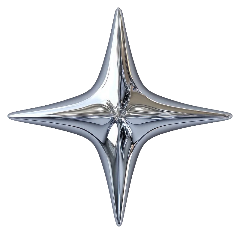
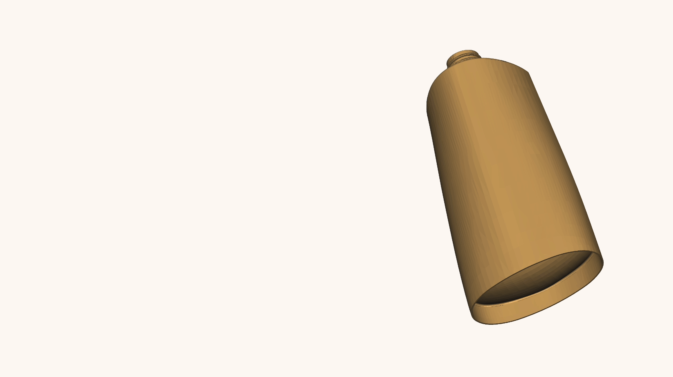
Redesigned Bottle

Redesigned Packaging
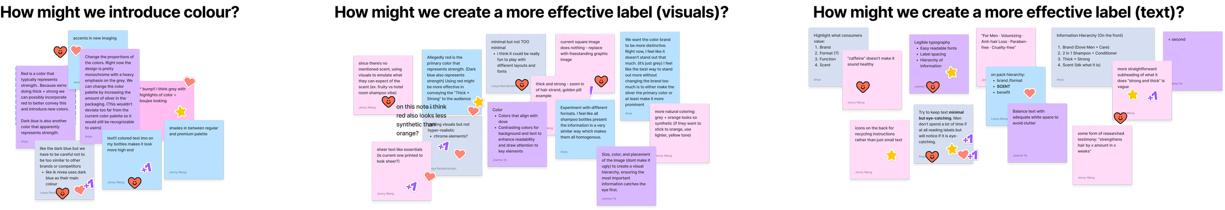
Front Label Design
Our approach to labeling went beyond aesthetics, we focused on functionality, clarity, and sustainability messaging, using both visual hierarchy and material design to guide user behavior and enhance brand perception.
We introduced organic imagery and embossed textures to align with Dove’s gentle, natural identity while subtly reinforcing the sustainability narrative.

Back Label Design
Our design rethinks traditional packaging by introducing a modular, reuse-first system built around eliminating unnecessary plastic and improving product usability.
The first purchase includes a durable pump, designed to last through multiple uses.
For all subsequent purchases, users receive only the bottle, significantly reducing plastic use over time. Each bottle is designed with a standardized neck to fit the reusable pump.
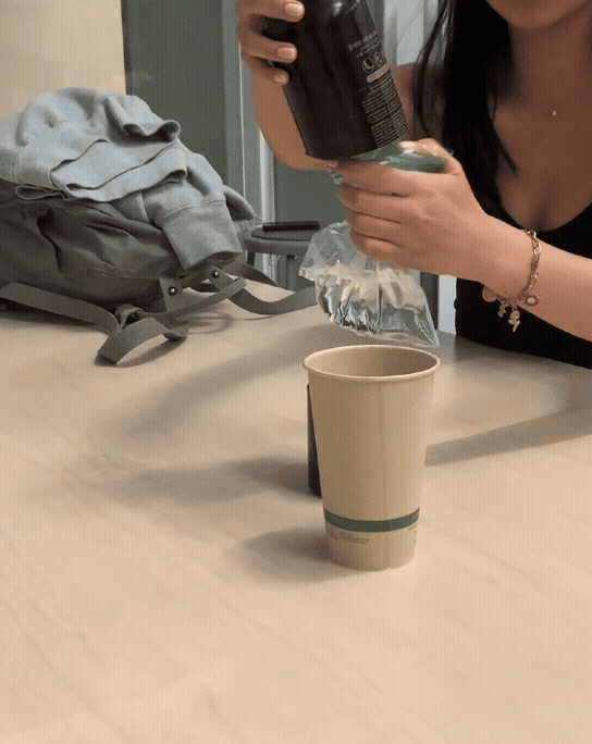
The bottle features a concave bottom, funneling the remaining product toward the center, making it easier to use every last drop.
It supports a better user experience while reducing waste from leftover product — a small but meaningful sustainability win.

Clear, functional visuals were used to demonstrate how the reusable pump system works — integrating small icons or step-by-step cues without overwhelming the design.
We also reworked the layout hierarchy to prioritize key information such as the reuse system, and the sustainability angle, helping users quickly understand the product at a glance.


but wait, how did we get here…?

Packaging
- Do men value packaging when it comes to making purchasing decisions?
Primary Research
Behaviour
- What do men gravitate towards to most when buying a product?
- What factors lead them to switch to a new shampoo brand?
Indifferent about sustainability, believe that a more sustainable product = a more natural product.
Drawn to minimalist and organic labels with neutral tones
Prefer bottles with pumps over bottles that require lifting; prefer keeping the bottle in a permanent spot
Next, we gathered secondary data on the opportunities and limitations of physical packaging design
The relationship between the amount of plastic used in bottle manufacturing (measured as bottle weight) and the amount of product packaged (measured as bottle capacity) is important
Environmental impact can be reduced through an increase in the product-to-package ratio (product weight/package weight).
This is achieved if less plastic is usedThe use of rigid bottles instead of flexible packaging helps with this, as flexible packaging for shampoos is made from multi-material laminates, while bottles are mainly fabricated with a single material. Flexible packaging recyclability is much lower than bottles
HDPE (high-density polyethylene)
Suitable to make all the parts of the bottles (body, cap, and label), is completely recyclable, and has a low price/performance relationship
HDPE bottles can be translucent or opaque, and they can be pigmented with different colors to be attractive
We also considered a variety of other materials including aluminum, and bio-based materials like sugar cane and polylactic acid (PLA) created from treated cornstarch. We finally decided to use HDPE due to its good cost to performance ratio.
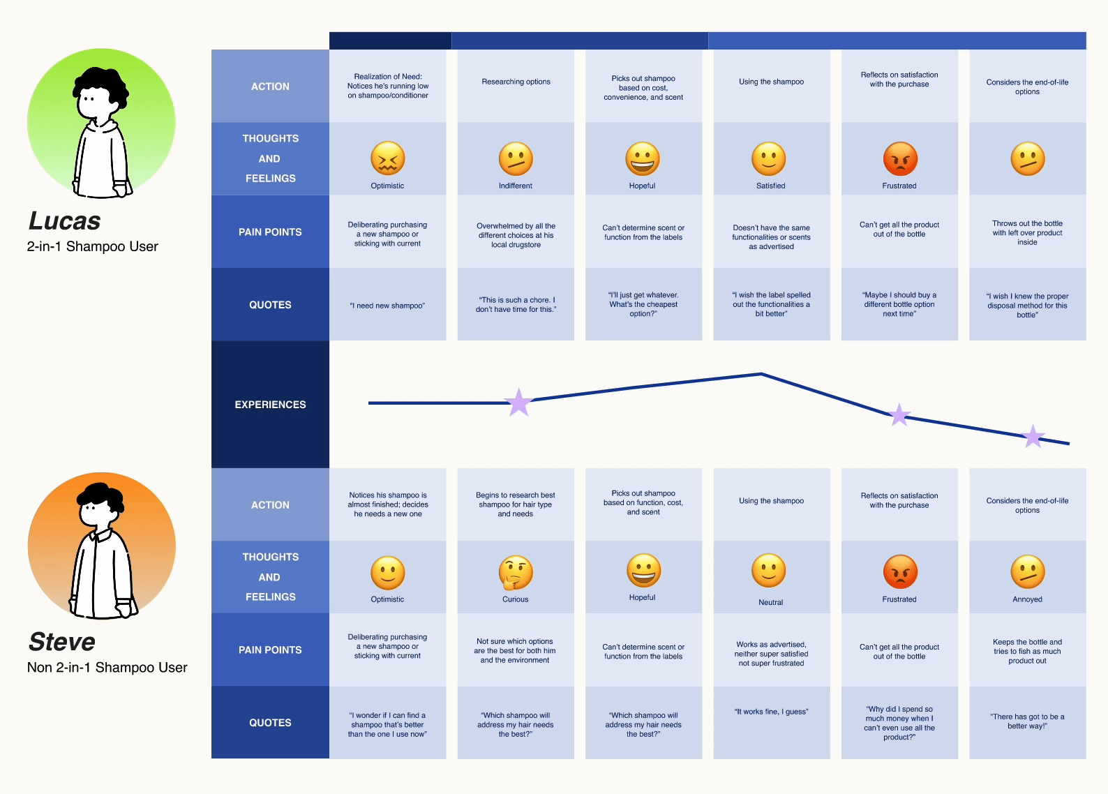
Synthesis Through User Personas

Through our research, we discovered that while the needs and wants of 2-in-1 users and non-users varied, they shared common pain points at key moments in the user journey:
Researching options: Many users felt overwhelmed or unclear when choosing between products, especially when trying to balance performance with sustainability.
Reflecting on satisfaction: After using the product, users struggled to evaluate whether it met their needs or aligned with their values, often defaulting to habit over conscious choice.
Considering end-of-life: There was widespread confusion about how to responsibly dispose of or reuse packaging, especially when pumps, labels, and bottles involved mixed materials.
We used these shared friction points to guide our design strategy. Rather than focusing only on differentiating for each user type, we created solutions that support all users during these key decision-making moments
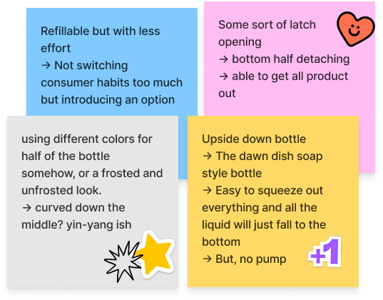
After an initial brainstorming phase, we generated a wide range of ideas from structural packaging changes to communication strategies and behavior nudges.
To evaluate these ideas systematically, we used a 2x2 matrix, plotting each concept based on two key criteria:
Innovation: How original or forward-thinking the idea was
Practicality: How feasible it would be to implement within Unilever's product and supply chain constraints
We prioritized ideas that landed in the top-right quadrant — those that were both highly innovative and practically achievable. This allowed us to push creative boundaries without losing sight of real-world application.

Ideation + Testing
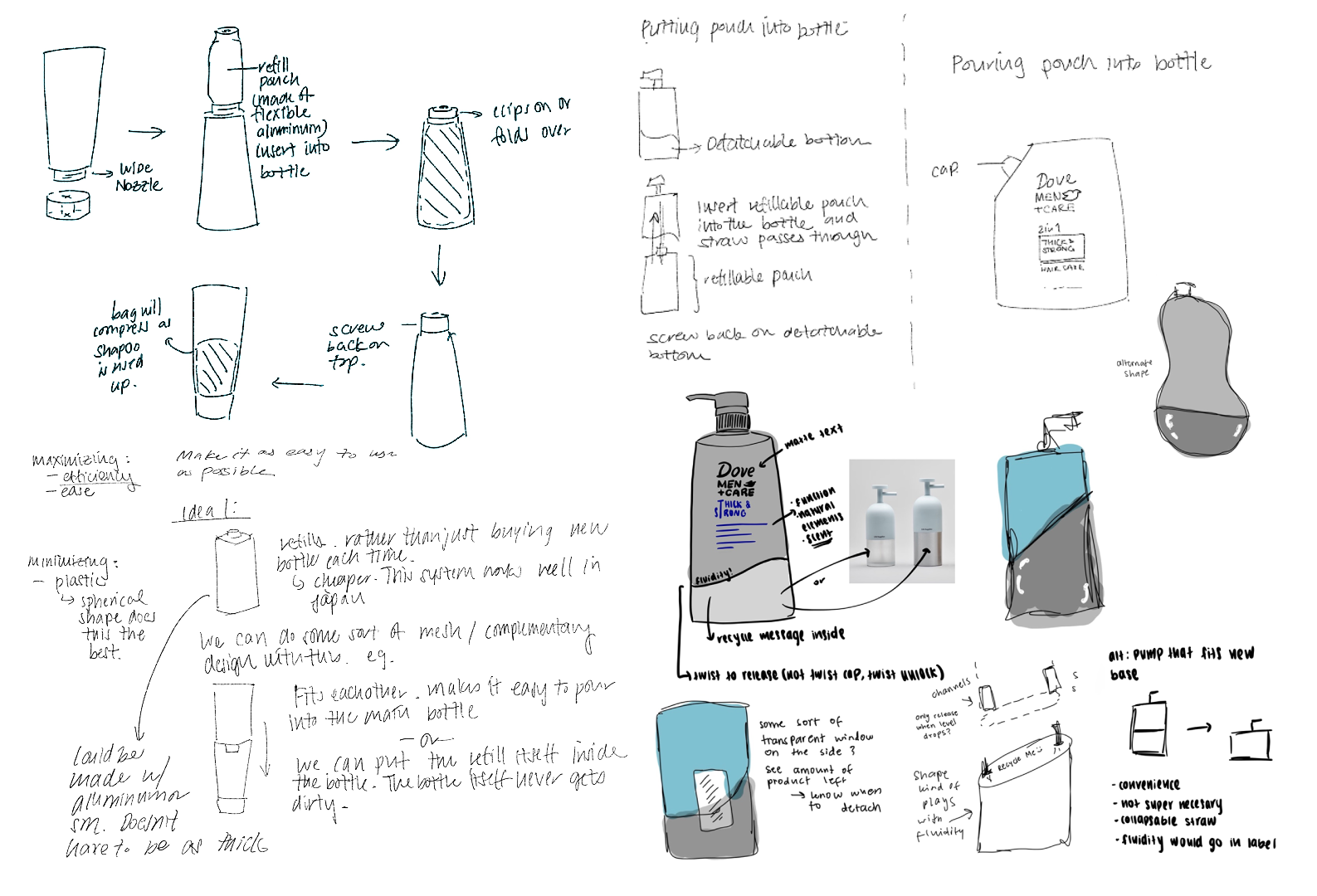


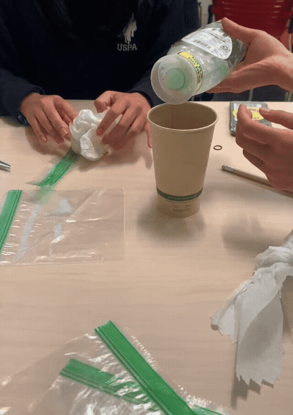
We began with physical prototypes to quickly test form, functionality, and user interaction. Our focus was on minimizing components and maximizing usability. Early concepts explored a Gravity Pump + Refill system with a detachable base.
We then conducted hands-on testing and focus groups with our target demographic, we validated that:
The pump operated efficiently under gravity-fed conditions.
Refills could be swapped easily without mess.
The refill could maintain shape even when nearly empty.


Survey Insights

Interview Insights

Sustainability ranks at a moderate importance level of 3 out of 5 for most men
They are moderately to more likely to switch to a new shampoo brand, given it's more sustainable
Cost and function are the leading factors that influence their purchasing decisions
Consumer Behaviour
Labels & Packaging
Consumer Behaviour
Secondary Research
Packaging Shape
+ Design
Packaging Materials
Sustainability
- Are men more likely to buy 2-in-1 shampoo for sustainability purposes or for convenience?
- Do men value sustainability?
Ideation
We began by collecting primary data, with the goals of discovering men’s thoughts on—
Reflection
This project was my first experience physically engineering a product, and it pushed me far beyond the screen and into the world of hands-on prototyping, material testing, and real-world problem solving.
I had to shift my mindset from purely conceptual thinking to something far more practical and constraint-driven.
Working with physical materials taught me that not everything can be solved with aesthetics or theory—things need to fit, function, and endure. I quickly learned that flexibility and durability don’t always go hand in hand, and that small changes in material thickness or shape can completely alter performance. I also learned that simplicity is hard! It takes iteration, testing, and constant questioning to arrive at a design that feels intuitive and effortless.
This experience taught me how to design with limitations, and in many ways, those constraints made the work more creative and meaningful. It gave me a deeper respect for the messy, iterative nature of physical product design—and the importance of grounding ideas in how people actually use them.Love my unilovers
